Visualizing Data Within the Canvas Chart
The Canvas SDK gives you access to real-time patient data and allows you to create custom UIs accessible from a patient’s chart. The combination of these capabilities allows you to create rich, interactive data visualizations your clinicians can access directly in the charting interface. This example will show you how we’ve used this approach to implement a pediatric growth charts feature.
In this guide you will learn how to: #
- Use the
ActionButtonhandler to provide a button, specify its location, and define its action in the UI. - Use the
LaunchModalEffectto display your custom visualization. - Fetch patient observations, such as height and weight, from the data module.
- Use the patient observation data within an HTML template.
- Combine all of the above to surface a pediatric growth chart visualization right in the chart.
Growth Charts #
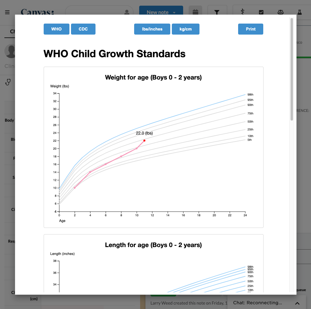
Growth charts are percentile curves showing the distribution of selected body measurements in children. A growth chart shows how a child’s height, weight, and head circumference (for infants) compare to other children of the same age and sex. It helps track a child’s growth over time and can indicate whether they are growing at an expected rate. Growth charts are commonly used by doctors to monitor development and identify potential health concerns. In this guide we will use charts from the Center for Disease Control and Prevention (CDC) to demonstrate how you can create your own.
The complete plugin is open-source and can be found in the Medical Software Foundation GitHub repo.
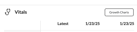
The plugin adds a button on the Vital Signs section of the patient chart that, when clicked, launches a modal displaying the patient’s height, weight, and head circumference measurements graphed against various percentile curves.
In the following steps, we’ll show you how we used the Canvas SDK to create it.
Adding a button #
To add a button to the vital signs section, you’ll implement an ActionButton handler. In your handler class, you’ll set the BUTTON_LOCATION constant to ActionButton.ButtonLocation.CHART_SUMMARY_VITALS_SECTION to make the action button appear in the corresponding summary section of the chart.
from canvas_sdk.handlers.action_button import ActionButton
from canvas_sdk.effects import Effect


class GenerateVitalsGraphs(ActionButton):
    BUTTON_TITLE = "Growth Charts"
    BUTTON_KEY = "show_growth_charts"
    BUTTON_LOCATION = ActionButton.ButtonLocation.CHART_SUMMARY_VITALS_SECTION

    def handle(self) -> list[Effect]:
        # This method is invoked when the button is clicked.
        pass
Launching a modal when the button is clicked #
Now that you have your button showing in the chart section, you can launch a modal when it’s clicked using the LaunchModalEffect
In this guide, we are launching a modal, but this click action can result in any effect your handling code returns.
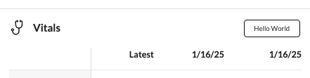
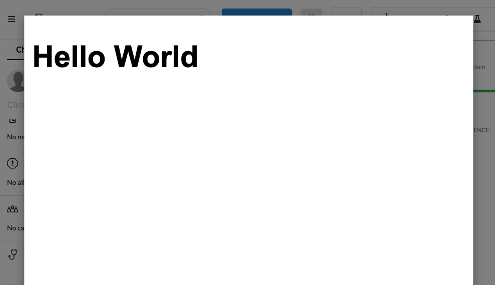
Here’s an example of a simple plugin using the LaunchModalEffect to display a “Hello World” message.
from canvas_sdk.effects import Effect
from canvas_sdk.effects.launch_modal import LaunchModalEffect
from canvas_sdk.handlers.action_button import ActionButton
from canvas_sdk.templates import render_to_string


class HelloWorld(ActionButton):
    BUTTON_TITLE = "Hello World"
    BUTTON_KEY = "show_hello_world"
    BUTTON_LOCATION = ActionButton.ButtonLocation.NOTE_HEADER

    def handle(self) -> list[Effect]:
        launch_modal = LaunchModalEffect(content=render_to_string("protocols/hello-world.html", { "title": "hello world" }))

        return [launch_modal.apply()]
And here’s the result!
Using HTML templates in the modal #
The use of templates allows us to render any kind of information from the data we have. We can even import external libraries from CDNs and add CSS styles to customize and enhance our modal.
To draw our graphs we use d3js, a free, open-source JavaScript library for visualizing data. How to use d3js is outside the scope of this guide, but you can find great documentation and tutorials on the d3 website here
Here’s an example of a template file name hello-world.html that receives a variable called title, which will be used inside the template.
<!DOCTYPE html>
<style>
    body {
        font-family: Arial, sans-serif;
        font-size: 30px;
    }
</style>
<script src="https://cdn.jsdelivr.net/npm/d3@7"></script>
<html lang="en">
    <h1 id="main"></h1>
</html>
<script>
    const div = document.getElementById('main');
    div.textContent = ``;
</script>
Fetching the observations #
To retrieve the patient data we use the Data Module. Specifically, the Observation model.
Here, we can use self.target, which is the patient’s id, to retrieve the patient and their observations by filtering for the values we need — such as weight, height, etc.
from canvas_sdk.effects import Effect
from canvas_sdk.v1.data.observation import Observation
from canvas_sdk.v1.data.patient import Patient


def handle(self) -> list[Effect]:
    patient = Patient.objects.get(id=self.target)
    sex_at_birth = patient.sex_at_birth
    birth_date = patient.birth_date

    observation_weight = Observation.objects.for_patient(self.target).filter(name="weight")
    observation_length = Observation.objects.for_patient(self.target).filter(name="length")
    observation_bmi = Observation.objects.for_patient(self.target).filter(name="bmi")
    observation_head_circumference = Observation.objects.for_patient(self.target).filter(name="head_circumference")
Tying it all together #
We now know:
- How to put a button in the chart
- How to launch a modal when that button is clicked
- How to create an HTML template to render within that modal
- How to retrieve data to use within that HTML template
All that’s left is combining these actions into a useful data visualization for our clinical users.
You can see our HTML template here, which draws many charts based on the observations provided and the percentile curve data provided by the CDC. To make that percentile data usable in our template, we transformed the Excel files from the CDC website into structured data we could use programatically. You can find those python representations of the percentile data here.
Here’s an excerpt:
who_boys_length_age = [
    { "x": 0, "y": 46.77032, "z": "5th" },
    { "x": 1, "y": 51.52262, "z": "5th" },
    { "x": 2, "y": 55.13442, "z": "5th" },
    ...,
    { "x": 23, "y": 92.93123, "z": "98th" },
    { "x": 24, "y": 93.92634, "z": "98th" }
]
In addition to the percentile data series, we of course need to plot the patient observation data series. To do this, we create a lists of x and y values corresponding to the patient’s age and measurements. You can see this in more detail in the GitHub repo, but here’s an excerpt:
import arrow
import datetime

from canvas_sdk.effects import Effect
from canvas_sdk.v1.data.note import Note
from canvas_sdk.v1.data.observation import Observation
from canvas_sdk.v1.data.patient import Patient

def convert_oz_to_kg(oz: str) -> float:
    return float(oz) * 0.0283495

def get_age_in_months(birth_date: datetime.date, date: datetime.date = datetime.datetime.now()) -> int:
    now = arrow.get(date)
    date = arrow.get(birth_date)
    year_difference = now.year - date.year
    month_difference = now.month - date.month

    return year_difference * 12 + month_difference

def handle(self) -> list[Effect]:
    graphs = []
    patient = Patient.objects.get(id=self.target)
    sex_at_birth = patient.sex_at_birth
    birth_date = patient.birth_date
    age_in_months = get_age_in_months(birth_date)

    is_less_than_24_months_old = age_in_months < 24
    is_less_than_36_months_old = age_in_months < 36

    observation_weight = Observation.objects.for_patient(self.target).filter(name="weight")
    observation_height = Observation.objects.for_patient(self.target).filter(name="height")
    observation_length = Observation.objects.for_patient(self.target).filter(name="length")
    observation_bmi = Observation.objects.for_patient(self.target).filter(name="bmi")
    observation_head_circumference = Observation.objects.for_patient(self.target).filter(name="head_circumference")

    weight_for_age = {}
    length_for_age = {}
    weight_for_length = {}
    head_for_age = {}
    bmi_for_age = {}

    for obs in observation_weight:
        if obs.value:
            note = Note.objects.get(dbid=obs.note_id)
            age_in_months = get_age_in_months(birth_date, note.datetime_of_service)
            weight_in_kg = convert_oz_to_kg(obs.value)
            weight_for_age[age_in_months] = weight_in_kg

    # ... repeat for other data series
Finally, we create a list of graphs with the necessary variables and data, which are passed to the template to generate and render the graph.
from canvas_sdk.effects.launch_modal import LaunchModalEffect
from canvas_sdk.handlers.base import BaseHandler
from canvas_sdk.templates import render_to_string

who_boys_length_age = ... # from growth_charts.graphs.who_boys_length_age


class Protocol(BaseHandler):
    def compute(self):
        # list of graphs
        length_for_age = {} # filled in the actual implementation, see linked GitHub repository

        graphs = [
            {
                "data": who_boys_length_age, # the data from the graph file
                "title": 'Length for age (Boys 0 - 2 years)', # graph title
                "xType": 'Generic', # the type of x axis (Generic, Length, Weight) - We need this info to convert the values
                "yType": 'Length', # the type of y axis (Generic, Length, Weight)
                "xLabel": 'Age', # label for the x axis
                "yLabel": 'Length', # label for the y axis
                "zLabel": 'Percentile', # label for the z axis
                "layerData": length_for_age, # the patient’s data that will be plotted on the graph
                "tab": "WHO" # the section where the graph should be rendered (WHO or CDC)
            },
            # ...repeat for other data series
        ]

        launch_modal = LaunchModalEffect(
            content=render_to_string("templates/chart.html", {"graphs": graphs}),
        )

        return [launch_modal.apply()]
By combining action buttons, the data module, and the LaunchModalEffect, you can create unique visualizations to help contextualize patient data for your clinical users.